In the past 15 to 20 years we have gone from patiently waiting for hours while downloading large video files to playing crystal clear, high-resolution video on any screen from anywhere instantly. These days streaming videos has become so common and popular that the term “binge-watching” even got added to the Merriam-Webster dictionary.
It seems like streaming videos over the internet serve like oxygen to the mainstream consumer. There are so many video clips available out there to suit everyone’s appetite, and as can be seen, we have quite an appetite.
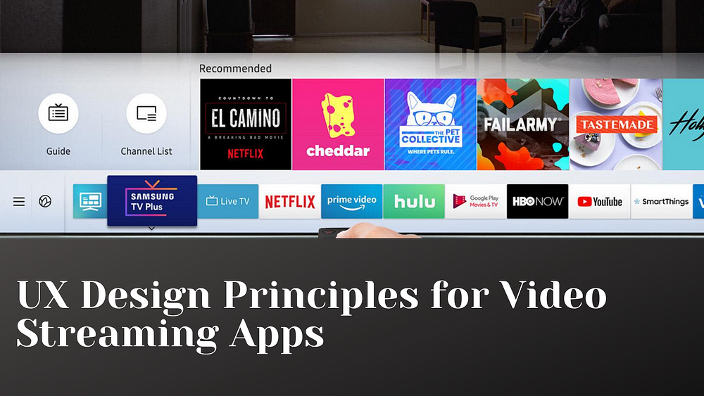
Earlier, for streaming videos, youtube was the only serious platform in town- as time passed, several other video streaming platforms came in the picture, with each new competitor in the market exerting evolutionary pressure on the user experience of delivering video content.
Nowadays, streaming video providers must give their users a pleasant viewing experience in addition to carrying the content they desire. We can see this effect in the paid decline of cable companies’ set-top boxes and their clunky user interfaces. There is no doubt that these cable companies have all the newest movies and hit shows but nobody wants to wrestle with such bad usability to get the good stuff.
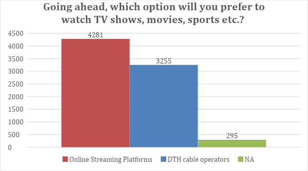
The above graph shows the massive difference in the preference of people while choosing between online streaming platforms and cable operators. So in a world where video content is fully liberated from clunky boxes, the only shell that contains them now is the user experience of the online video streaming platforms. Retention is the key to the growth of these companies in such a competitive market.
So how do streaming video apps keep users engaged?
Currently, there are several best design practices used by the best 4 streaming video apps:-
Personalization is important only up to a degree
All the apps include personalization to a certain point. It becomes less prevalent when you go deeper.
Content is sacred
Don’t sell past the close. Once the user decides what show to watch, don’t get in the way, or distract them from the actual content. If done otherwise, you might risk losing your viewer’s attention.
Always encourage “one more…”
Always offer the audience one more swipe, episode, minute, etc. Your design should include smooth segues between content. The ‘peekaboo’ style presentation keeps users constantly scrolling to see the next show or movie in their curated lists.
Thumbnails are important
The only info users have with which they can make a viewing/ buying decision is by looking at the content thumbnail. So the only thing you can do is give them as much breathing room as possible on the small screen.
Video streaming platforms all look similar
There are so many streaming video apps these days but the major drawback is that they all are similar in many ways which means there’s currently lots of room for innovation in the designing of streaming apps and it will be hugely impactful.
The video content available is huge and the paradox of deciding what to watch is always overwhelming, so the opportunity to innovate is also huge.
Embrace the Default effect
People are more likely to accept the options that are set by default for them, changing options incur cognitive load, this is a psychological phenomenon called the Default Effect.
Desirable browsing behavior needs to be topped by suggesting content to browse upfront.
Users won’t be engaged if they have to do the legwork of finding the content to browse because that’s why they came to you in the first place.
Technological advancements breed more ways to use the content
Cheaper internet connections and faster bandwidth speeds lead to more accommodation for trailers, clips, highlights, etc.
Comments
Post a Comment