
The world of the web and web design is changing every few days. This change is driven by trends, new techniques, and users who demand more. And to remain relevant, we all have to stay on top of it. So, here are the top 8 phrases and terms that you need to add to your vocabulary right now. All these words are related to user experience, and in essence, are part of the design process.
Breadcrumbs
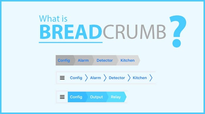
As we have seen in fairytales, a trail of breadcrumbs can show you all the places you have been to digitally too. This is done with Digital breadcrumbs. It also helps to create logical navigation.
They show users where they have been on your website. They can be represented by text, images or glyphs, and link back to previous pages. This navigation might appear at the top of a page. Even desktop computers use breadcrumbs to tell how the user navigated through specific folders to reach the current location.
Engaged time

Several tracing tools like Google Analytics allow website owners to get a really good look at what users like and respond to. If you track engaged time on a site i.e. the amount of time spent by a user on a specific page, you can determine what the user wants from your site. The pages which are more popular among users usually have higher engagement times. An engaged user is obviously a happy one and will interact more with your product and service by making a purchase, signing up for an event, or clicking a link. Higher engaged times also mean that the user is likely to return to your site in the future because they found it valuable.
Experience Architecture
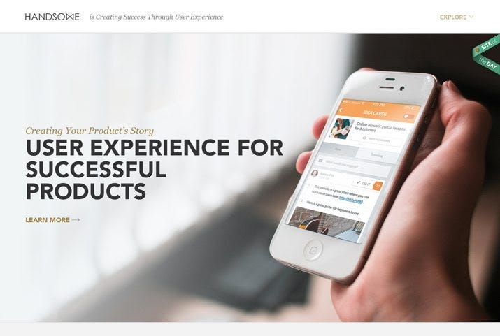
Experience architecture constitutes the combination of multiple design and UX processes- information architecture, interaction, and experience design. The experience architecture that provides a simple and valuable relationship with users is considered a good one.
- Information architecture is designing around an information model or concept.
- Interaction design is creating a pattern of behaviors for a product and its users.
- Experience design is the process of figuring how a design will work in the design process across multiple platforms.
Eyetracking
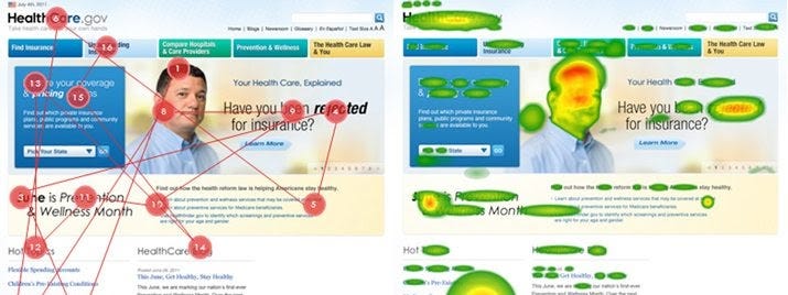
It is a research method that with the help of technology is growing in popularity. It uses different tools like glasses or other eye devices to record where users look first and subsequently when in contact with a website. This data helps to know which visuals best draw the user’s attention.
Geolocation Indicator

Geolocation indicators help the users to know if they are in physical proximity to something else. Its services are especially popular on mobile apps and fo mapping services. Location-based design is on a boom right now. It makes everything that a user does become more specific and tailored especially according to that user.
KPIs
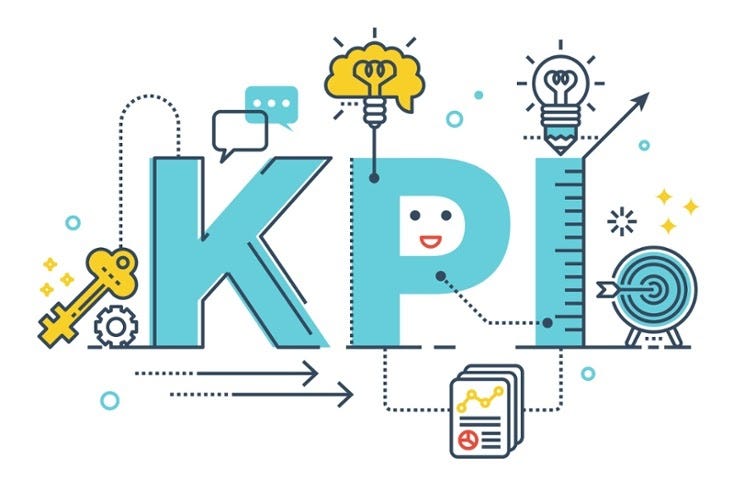
Key performance indicators measure the usability of a website or design. KPIs measure current usability, trends over time, and comparisons with competitors. The end result data shows how users interact with a website and if the design works in the way the designer or developer wanted.
Observational study
Actual users conduct an observational study to see how they act in relationship to your design. The facial expressions of the users, type of body language, and the overall positive or negative experience, all these things are observed and notes in an observational study.
These studies might be somewhat expensive to conduct but are a great real-life look at how people will perceive your website or app. This research helps to understand how people interact with something but doesn’t give much feedback on why they behave in such ways.
Widgets
Widgets are the most commonly known devices across a variety of pf websites and platforms. It is an onscreen element that users interact with. Earlier, almost all websites included a traffic counter i.e. a widget. Other examples of widgets are calendars, sliders, buttons, and contact forms.
Comments
Post a Comment