
Amazon is a one-stop e-commerce website to browse and get product details, read reviews, and purchase millions of products that are available. Amazon has one of the most efficient user interfaces which in turn creates a superb user experience.
Amazon is one of the best sites to take an example from for designers of e-commerce sites considering the amount of traffic it generates.
Easy-to-find products are Easy-to-sell products
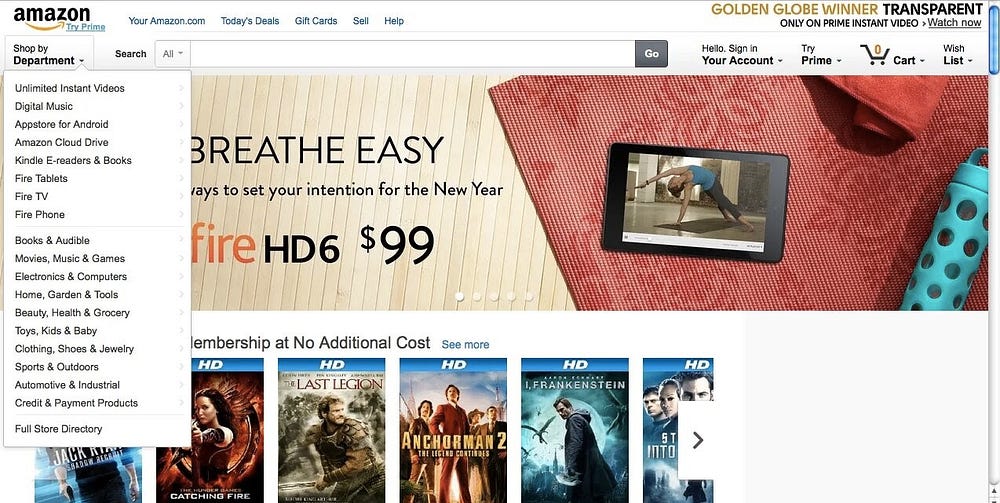
When you search for an item on Amazon, you’re presented with an interface delivering incredible aggregated information. Along with the Amazon price, you also see options for other vendors carrying new and used items. What was once built to become an online department store has instead become a network of sellers that offer the user a wide range of products.
Amazon currently sells over 480 million products on its US site alone. The number of choices that Amazon offers, along with the aforementioned aggregation of links and the algorithm that customizes each registered user’s needs makes Amazon one of the most complicated websites you’ll see on the internet today, and yet the nested interface helps to make the front-end experience surprisingly simple.
User reviews boost UX
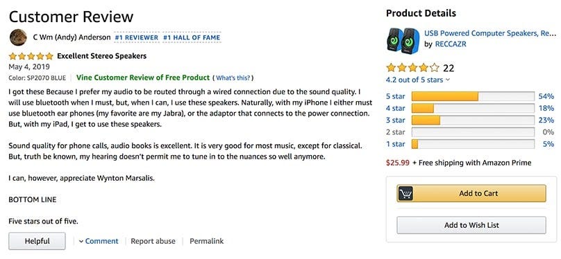
Amazon has great usability for review-leaving customers. It rewards frequent reviewers by assigning them a “Top Reviewer” badge. Amazon encourages customers to leave reviews because they contribute to a better user experience.
Most consumers rely on reviews before making a purchase decision. It reduces their anxiety regarding if they should buy that product or not and helps them to know that product better.
The easy ordering process for frictionless experiences
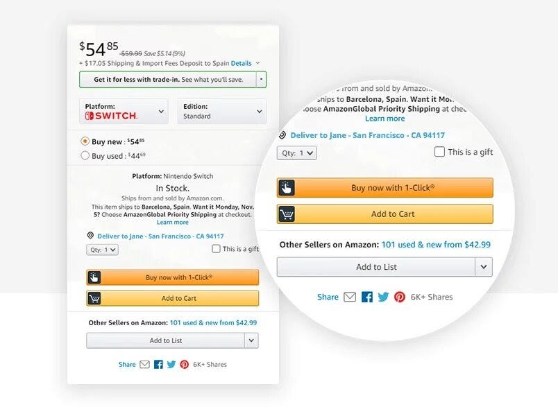
The idea that users could enter their payment and other information once and then keep buying thereafter just by a single click revolutionized online shopping and it became a game-changer in the world of e-commerce UX.
Amazon’s one-click ordering system helps to reduce friction as well as cognitive load. Users don’t need to fill several unnecessary form fields and apparently, they don’t get any time to get cold feet about their decision to purchase the product.
E-commerce UX’s Roach Motel
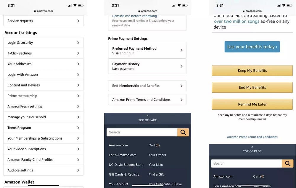
If you have ever tried to leave Amazon’s Prime account then you must be familiar with what’s known as the “roach motel” tactic. When a user tries to delete their Prime account, this dark UX pattern takes them through various screens involving lots of confusing dropdown options which makes it a little frustrating and which in turn results in the user giving up the thought of deleting their account.
Some other basic lessons we can learn are:-
- The more complicated the site and the greater availability of choices, the simpler the UX must be. Nesting and layering the information is more useful instead than jamming in top-level navigation items.
- Build trust and loyalty in the experience through smart UX decisions. Trust can also be built by displaying logos of top brands you work with and featuring testimonials either with photos or through videos of customers.
- Give buyers a chance to change their purchase decision at different stages of the checkout process. Build forgiving interfaces to reduce the frustrating experiences.
- Big images always sell the product. Amazon uses a utilitarian approach by featuring a carousel of on-sale products at the top of the page, but you can take a more elegant approach by using hero images if you’re a smaller e-commerce store.
Good work
ReplyDelete