"The people who are crazy enough to think they can change the world are the ones who do"— Apple’s Think Different commercial, 1977
When we think about some of the most innovative and ingenious technology companies from the last ten years, chances are, Apple would be one of the first to come to our minds. Apple is best known for leading the market through its design and creative, innovative products. It has attracted its user’s love by achieving the empathetic design challenge. No one can doubt the power that Apple has to sway millions of people into standing in line for hours just to buy a phone. They have an army of loyal customers that would promote their products and buy absolutely everything that they produce, no matter what the cost.
What made Apple so popular?
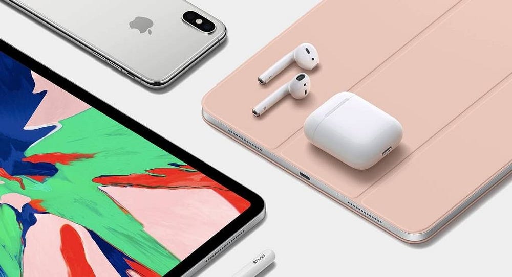
The answer is- its innovative technology and simplicity. The fact that how Apple manages to bring something new to the table every time with every product release and also how simple its products are, is the reason why it’s so popular. And that’s exactly where the design process comes in.
Creativity is not enough to transform a design into a successful product, it always requires an innovative process to be implemented in order to achieve this goal. Their design process wasn’t just a process but a way of thinking.
We can’t even think of another brand that has managed to achieve the same level of fanbase that Apple has. And they were able to do all these things because of the following factors:-
Good usability
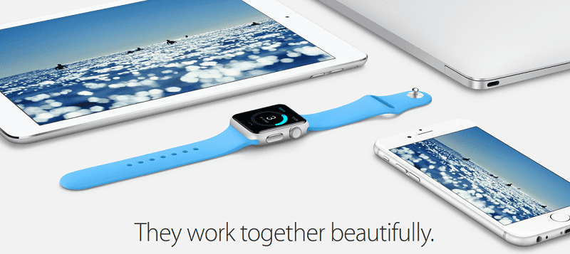
In terms of functionality, they know how to create a product that’s really easy to use. Pick up an iPhone or iPad and you can use it without struggling to work out its features. Apple is known to put ease of use as the main goal when designing a product. As technology continues to advance, Apple still manages to create a product that works for absolutely anyone using it.
Consistency
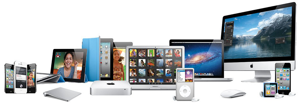
One thing that Apple is really good at is keeping it’s brand consistent. They are obviously evolving but the changes they make don’t affect the look and feel of their overall brand message.
You will get the same customer experience when you visit their website or even their stores. This helps people to get familiar with them, n matter which channel you are choosing to connect with them from.
Evolution
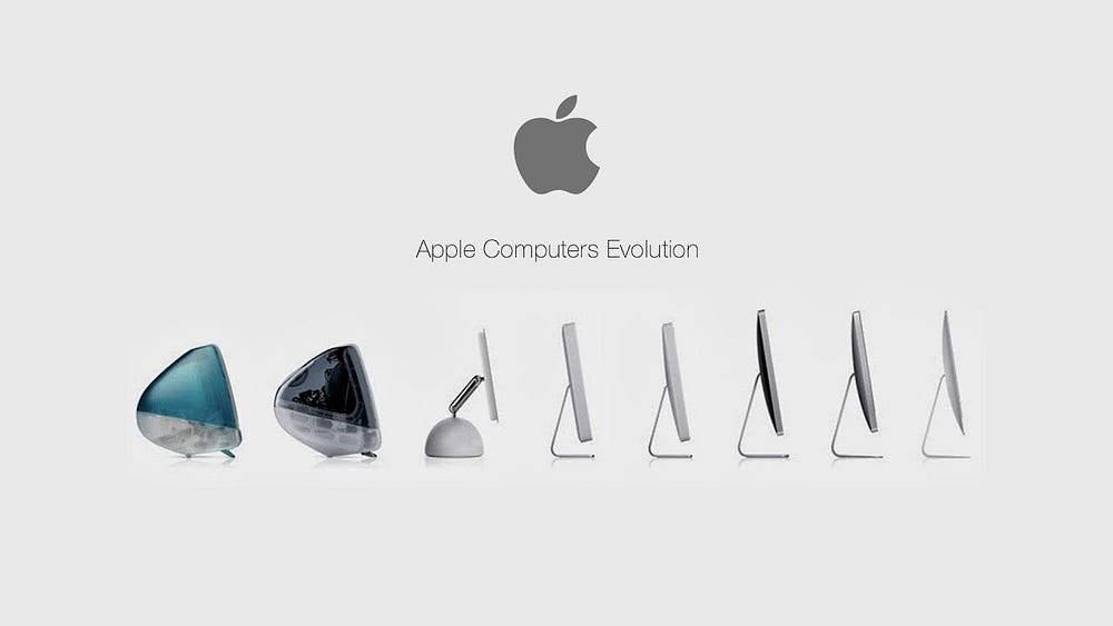
Even companies like Apple needs to keep evolving themselves so that their audience can always expect something new and exciting from their latest product launch. And this is the reason they stand as a leader rather than a follower. What started as a computer company is now famous for phones, TV, music and so much more. Evolution is the key to success and Apple knows this very well.
Making their own decisions
Apply doesn’t rely on market research or focus groups or personas to create its products. Instead, they listen to the people they hire and their engineers and create a product that they would want for themselves.
Ignoring your audience completely would also be foolish, but if you are the expert in your field then use it to create something new that the audience will love.
Detail focus
Apple focuses on the details. They look for the smallest thing that could make a difference. Instead of solving the bigger problems first, they focus on the small ones which could be the root cause. Apple made a lot of small tweaks to their products and changed the ways how things worked for the better. It is detailed oriented. They focus on every aspect of the experience and knew what the customer wanted even before they did.
Having a strong understanding of the details allowed them to see a clear version of the bigger picture. They could see where the future was headed. That’s what Apple did, and that’s what changed our future.
Creating the future
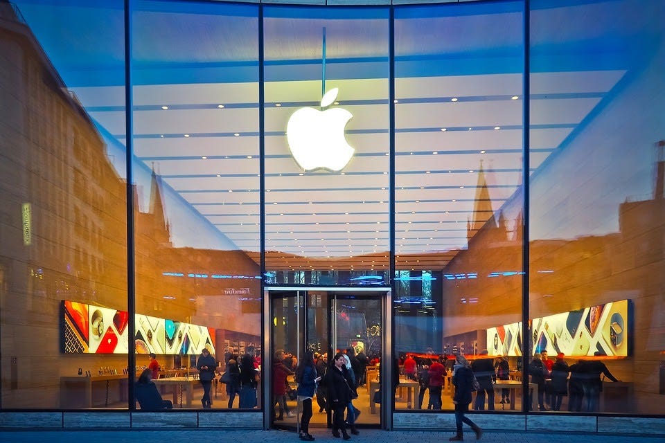
Apple’s design standards changed how the user’s perceived everything. They influenced how every product is built and how every product is designed. As users, we are accustomed to simplicity in the products. We expect to use products as tools.
"The product is not the experience. The task is experience. If you can do what you set out to do, easily, is what determines if a product works"
Apple made this its mantra throughout its growth and change. They kept this in mind throughout their revolutionary new product releases. The future has already happened and it continues to happen every day!
Comments
Post a Comment