Conversion is truly king when it comes to business on the web. It doesn’t matter if it's email subscribers, new accounts, or good old-fashioned purchases, one thing is for sure, conversion makes or breaks the businesses online. So, below are the top 10 tricks that might help you to improve your business by increasing the conversion of your landing pages.
Testing is the key
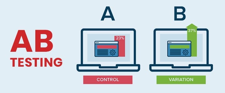
Before you start spending start testing. Learn what users think. Remember it and do the same with your design. Then, once you find the direction you are comfortable with, put it to test. Start with A/B testing. It will help you to try larger variations of design and copy and fine-tune with multivariate testing of discreet elements.
Captivating headlines

It is only a matter of 8 seconds for people do decide if they want to abandon your landing page or not. So, your headline plays a very important role and is often your only shot at convincing them to visit it. Be clear and confident in what you are offering and they will get out of the deal. You have to summarize what the user will get from you in five words or less.
Most of the time, clever or cute wording doesn’t convert. People don’t like to figure out the meaning of your words especially when they are short on time. So, try to be specific, brief, and compelling.
Write killer content
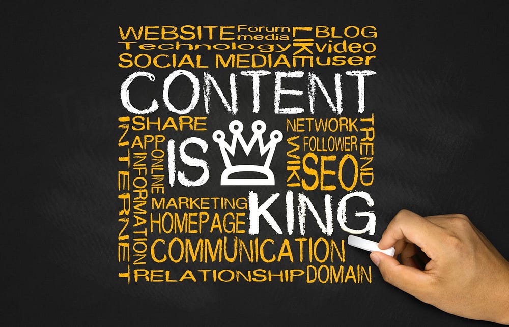
If you got their attention with the headline, you will also need awesome content for when they land on your page. If you have a content strategy for your landing page then it ensures that you tell a compelling story that resonates with your users.the brand narrative should be weaved in while you communicate the essentials. All of this should be done while maintaining crystalline clarity. The user should be quickly able to understand what you do and what you are offering. Your content should be explicit, bold, and direct.
Eliminate giving them several choices
Avoid creating analysis paralysis for your visitors. Give them one choice. More options lead to confusion and confusion doesn’t lead to anywhere good. Eliminating choices makes the conversion option easier to understand and also to take action upon. Lesser the friction, more the conversions.
Ask for the absolute bare minimum
Always remember, fewer fields leads to more conversions. This isn’t rocket science, but you would be surprised to know how many people fight for fields that in the end do little more than kill your conversion rate.
Don’t bury the good stuff
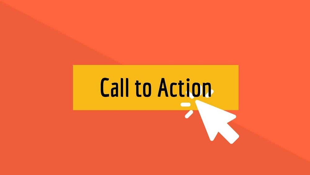
People don’t scroll on a landing page unless they are really intrigued. Keep all the good stuff above the fold. Particularly the main benefits that you offer and the call to action. The initial eight seconds are the most important, so keep it up top and easy to digest. If your content is really long, repeat the call to action at the bottom of your page also.
Use real and happy people
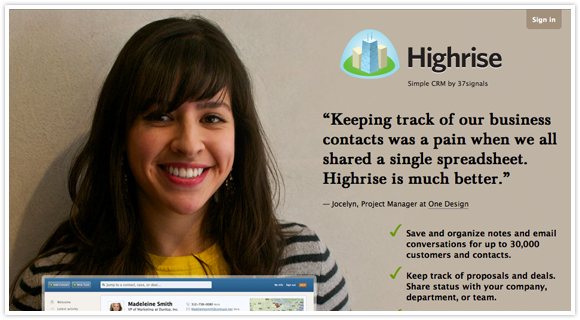
Trust plays a very crucial role in conversion. And trust comes from other people. A person’s face on your landing page can increase conversions instantly. So many studies have proved that there is a major impact of human faces on website conversion.
Video always helps
If you need to explain something related to your product, put a video that shows the benefits of the product in action. But one thing to take care of here is of the video thumbnail because that’s the first thing that users will see when they visit your page. Go with fewer words. Give your visitors a succinct and enjoyable video to watch. That’s all you need to do to see your conversions go up.
Use testimonials
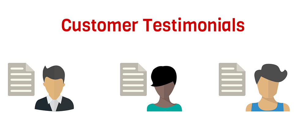
Stuff like logos, likes, or pins shows the visitors that other people love what you are offering.
Most of the time visitors turn to what others have done to help them decide. Increase the conversion by logos, reviews, testimonials, and other social proof that help a visitor who is confused to make a decision you want them to make.
Design according to need
Someone visiting your landing page from a lengthy blog or an article needs less information than someone coming from a tweet. Everyone has different needs and expectations based on where they are coming from i.e. their inbound source. You can crank conversions higher, once you understand and create landing pages tailored to them.
Comments
Post a Comment